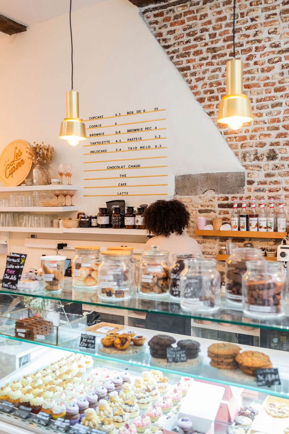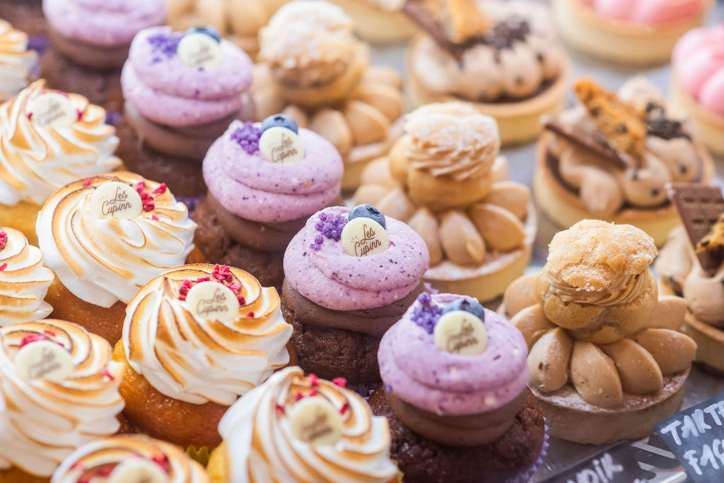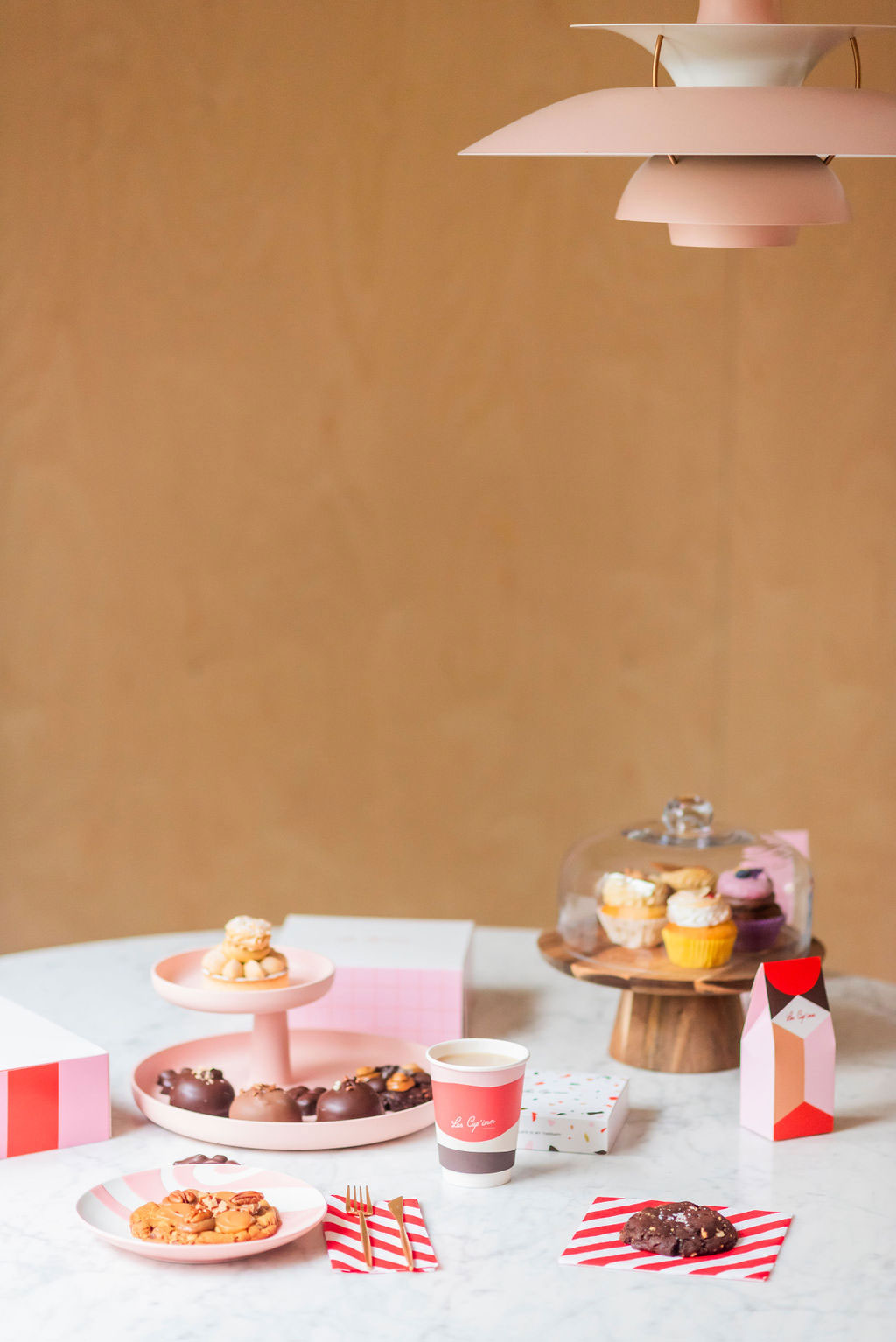
Cup’inn is the slightly crazy adventure of two friends. They decided to open a tearoom in Namur in 2014. They wanted to dust off the concept by updating it. The aim was to make it a lot more “fun”. They set their sights on the Anglo-Saxon pastry of the moment: the cupcake. But they were far too greedy and couldn’t bring themselves to make just one pastry. So they added cookies, brownies, cheesecakes and lots of other sweet treats.
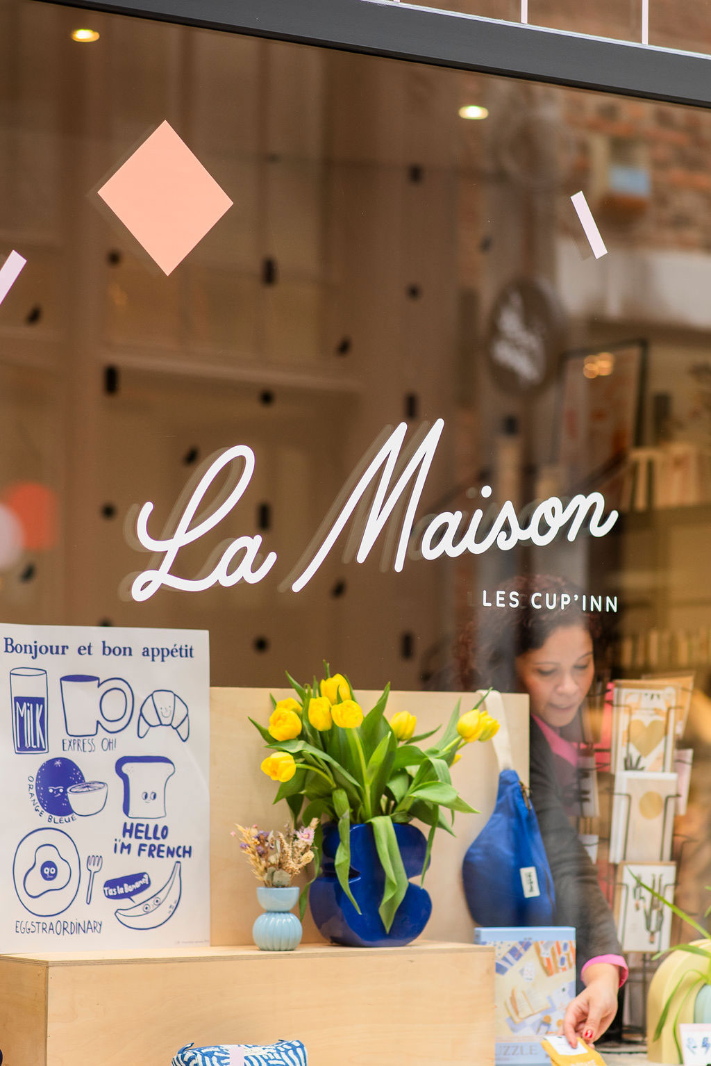
After almost 10 years in business, Les Cup’inn decided to revitalize their concept. Opposite their patisserie, they opened a decoration store called “La Maison”.
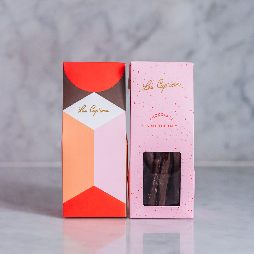
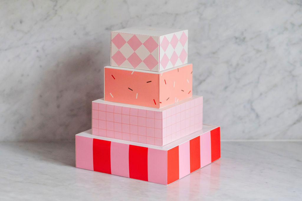
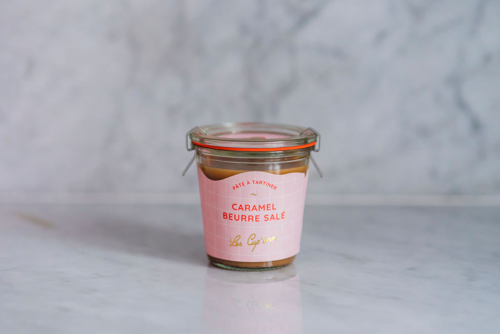
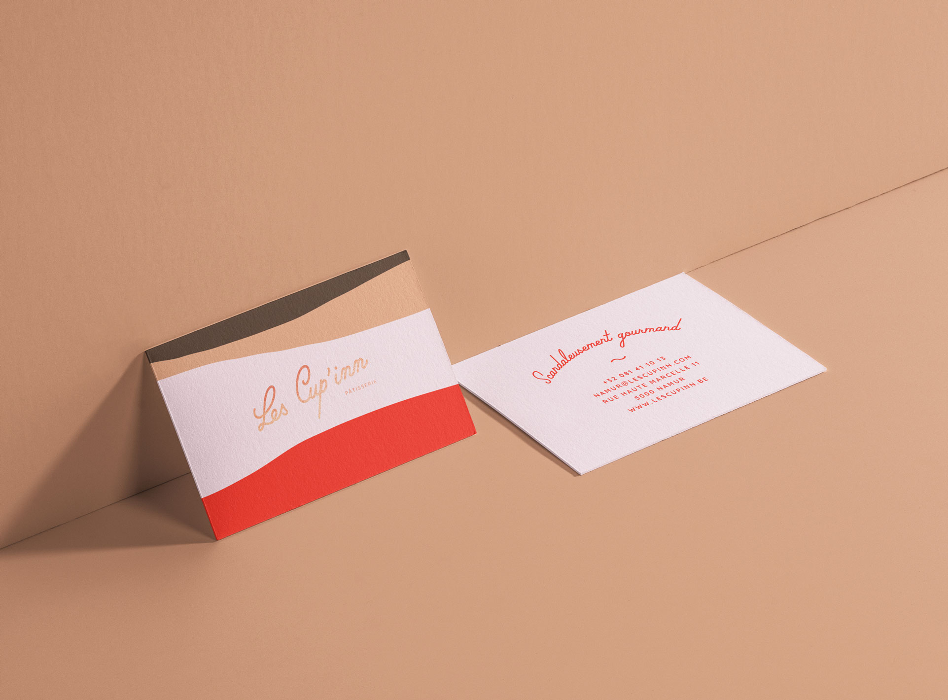
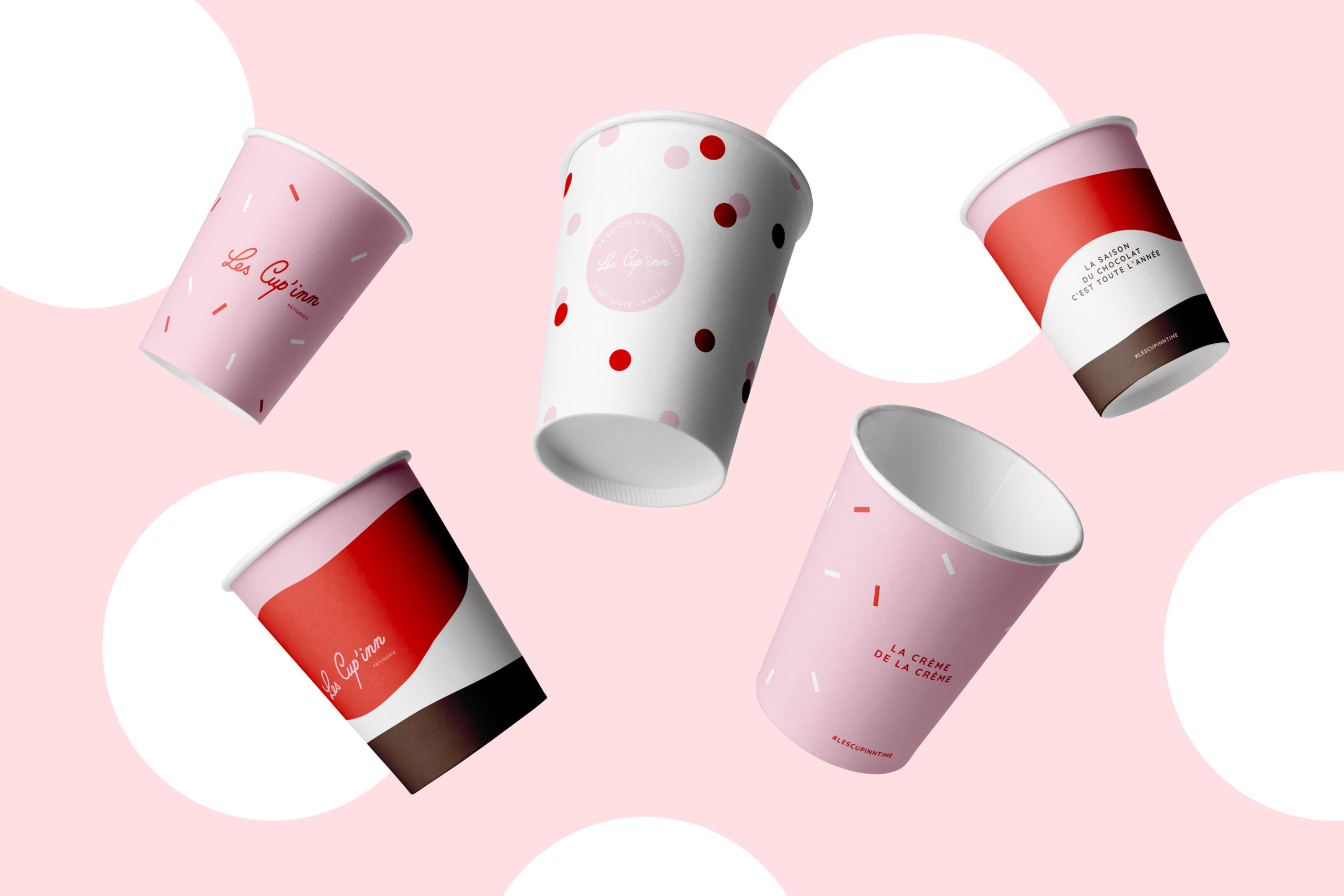
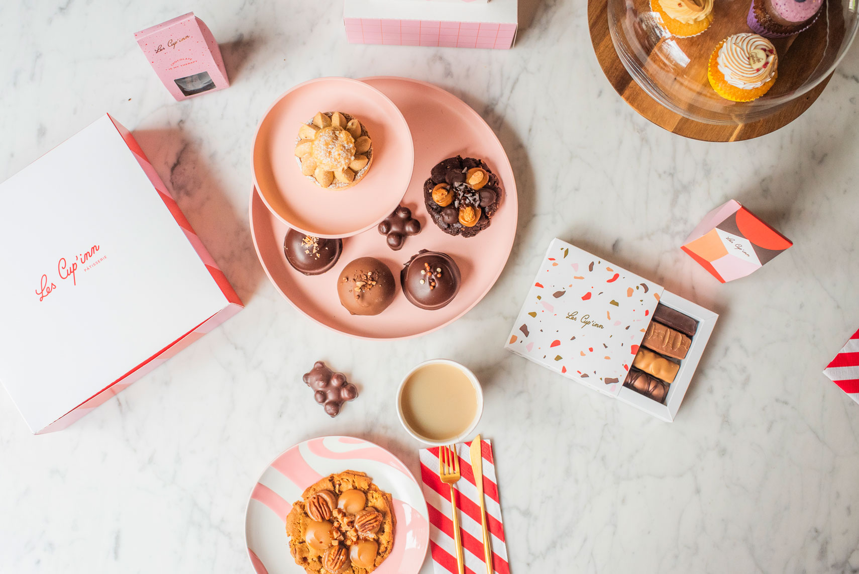
It was the perfect timing to enrich their graphic identity. The aim was to finally have communication and packaging that would match the incredible quality of their patisserie and services. This graphic identity also had to be adaptable to the store decor part of the project.
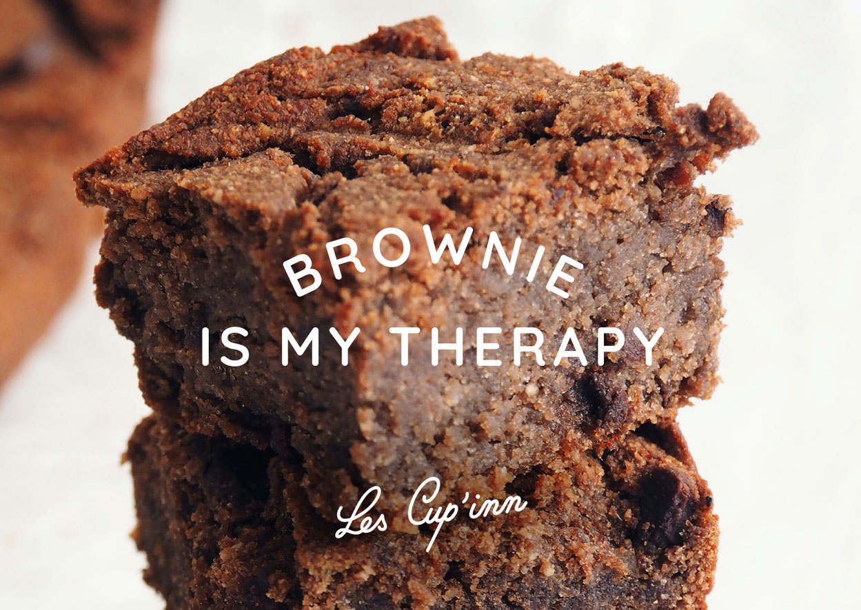
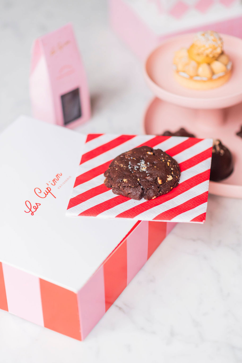
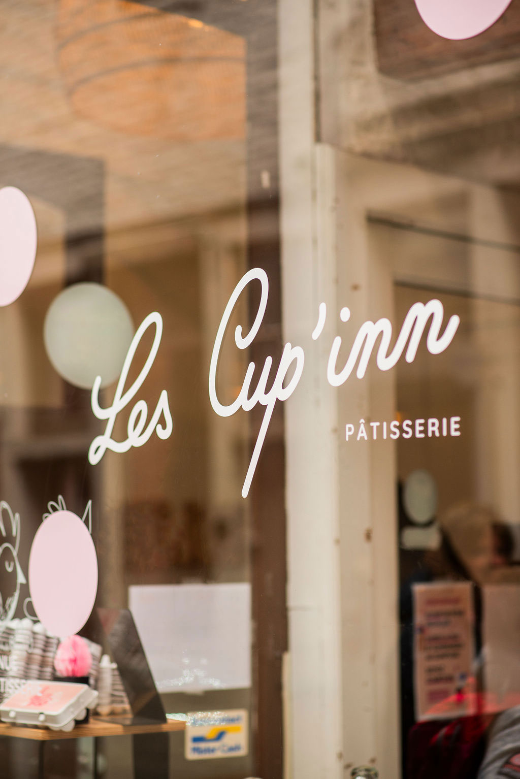
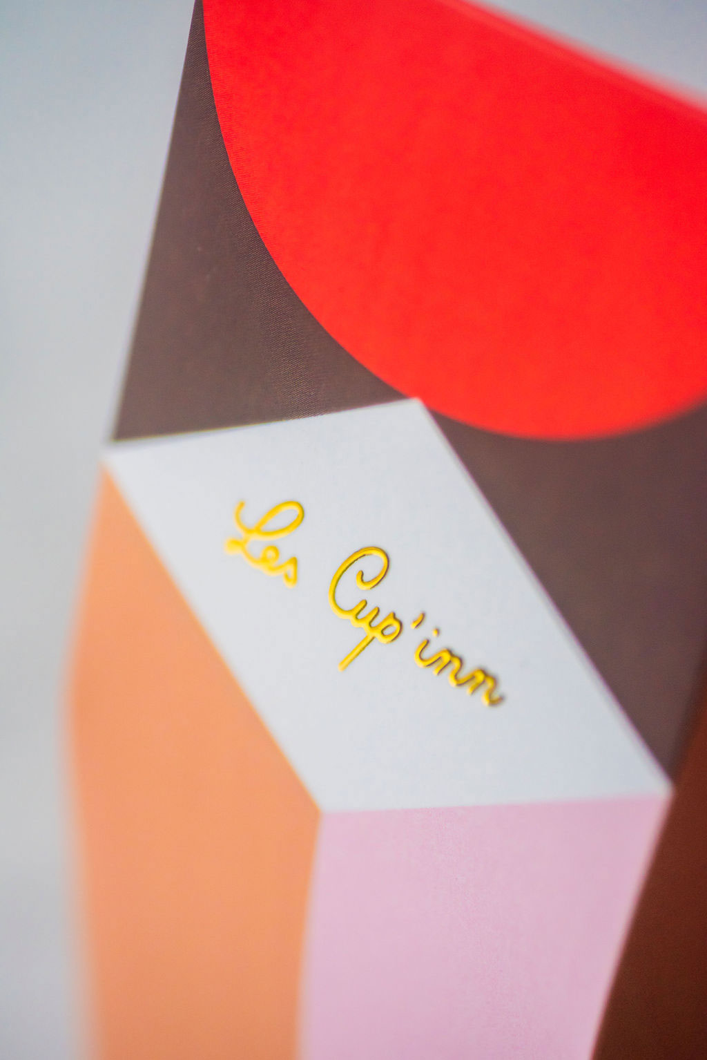
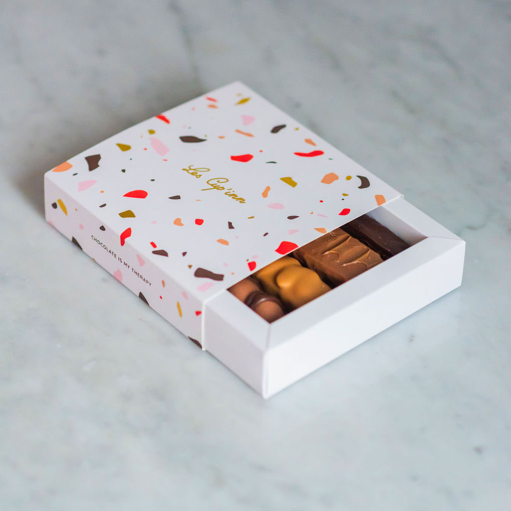
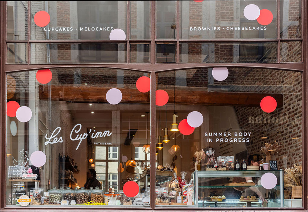
And that’s where our graphic design agency Studio Fiftyfifty, with its passion for new food projects, came in. Our graphic designers built around the existing logo a vocabulary of shapes and colors to match Cup’inn’s culinary creativity: polka dots, stripes, squares, bursts of color… Our Brussels-based graphic design studio applied this to packaging, multiple communication media and window dressings according to the season.
If you’re passing through Namur, you’ve got to make a detour. It will be a real treat for your eyes and taste buds.