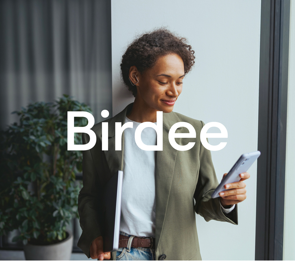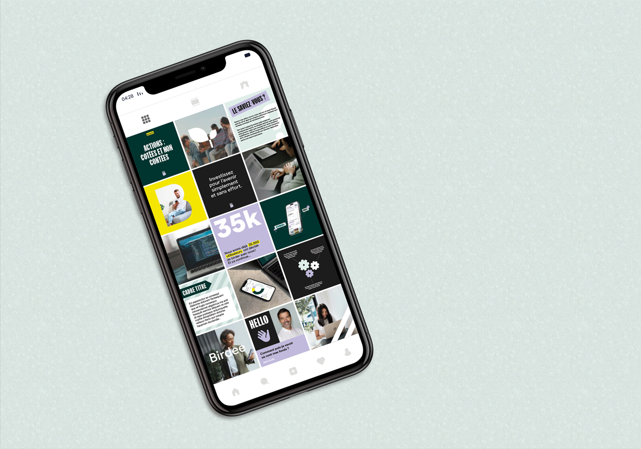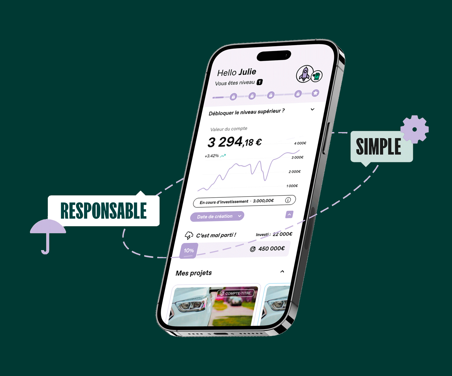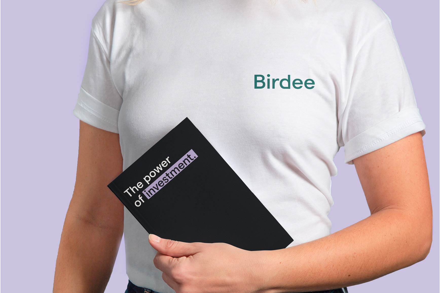
The rebranding of Birdee reflects a complete transformation of its visual identity. Birdee is a responsible investment platform. It offers a B2C application that allows users to invest with a small initial amount. Each investor benefits from personalized support to meet their specific needs. In addition to the B2C model, Birdee adopts a B2B2C approach. It offers its online investment interface to several neobanks across Europe.
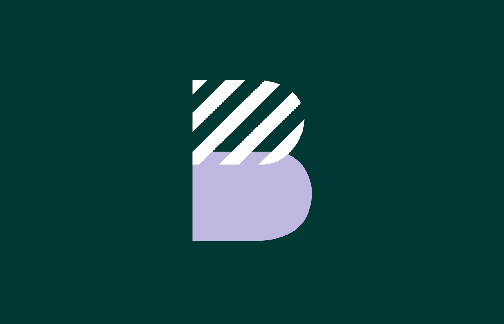
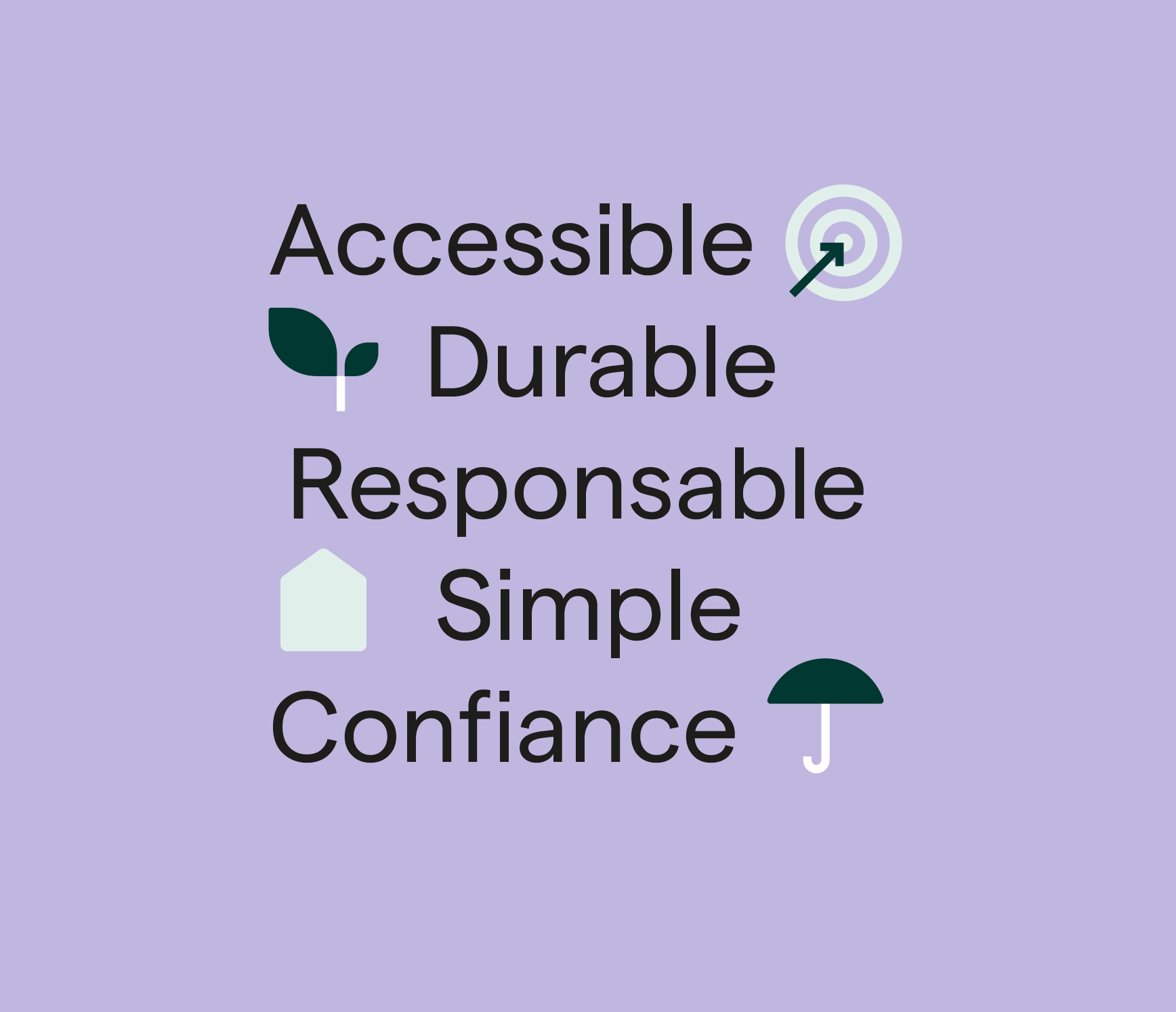
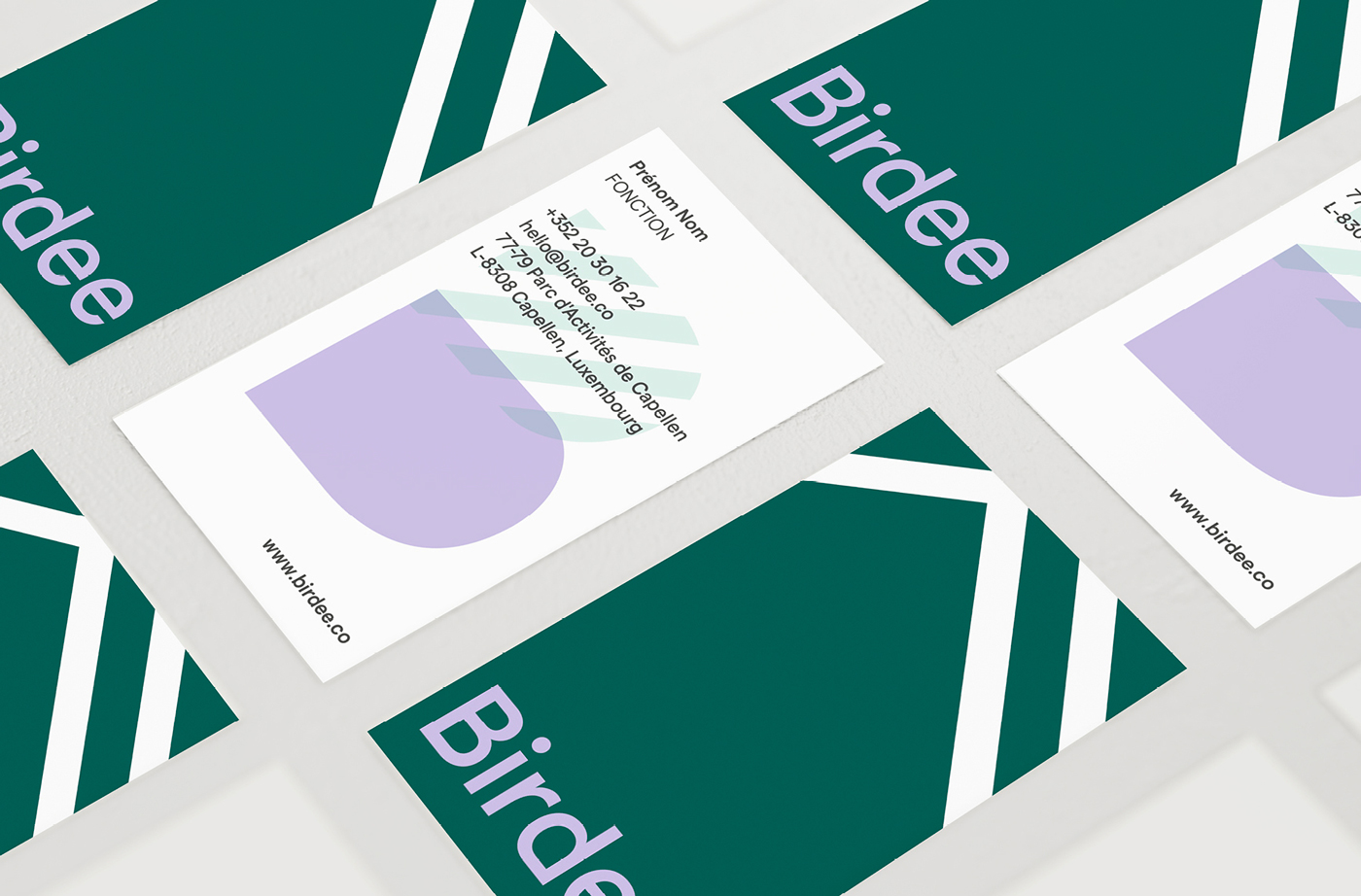
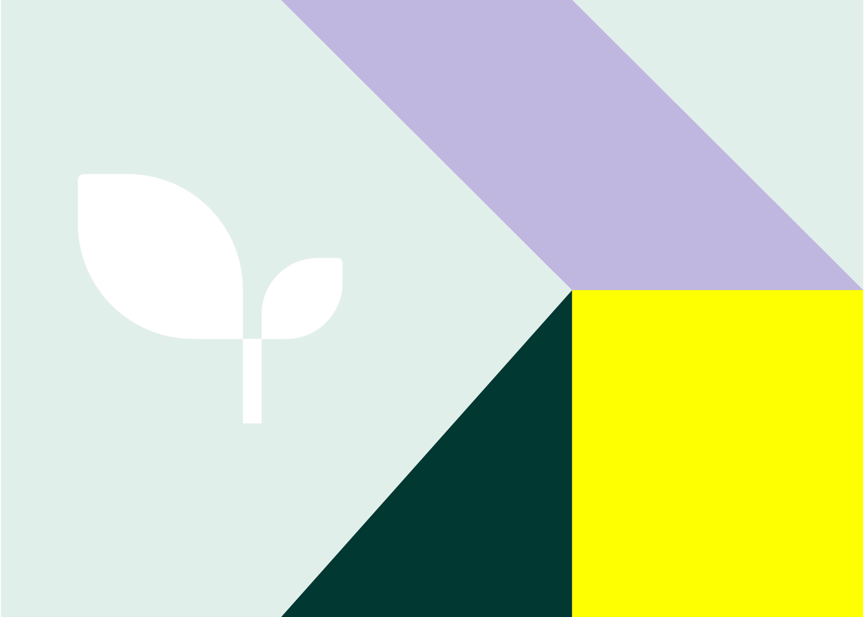
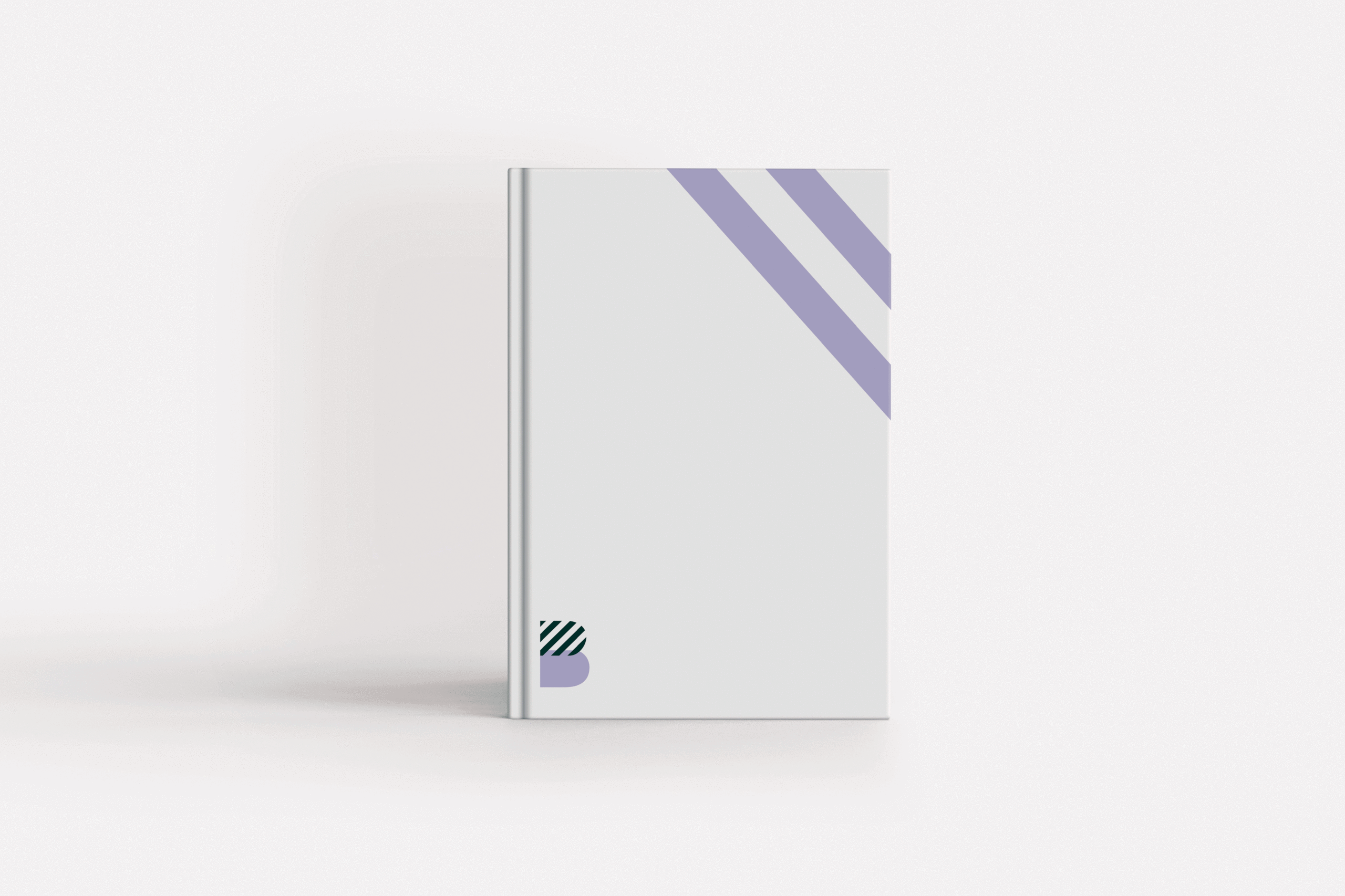
For this project, Studio Fiftyfifty created the new logo and the complete visual identity. We also repositioned the brand and developed its storytelling. The logo moved away from the bird symbol to highlight the name Birdee. This change emphasizes the brand’s unique identity. We chose modern colors: mauve and green. These shades convey trust, innovation, and responsibility.
Line-based patterns were incorporated throughout the visual identity. This approach gives the brand a contemporary look. The goal was to make Birdee more accessible and user-friendly for the B2C audience. The B2B aspect was strengthened to make the brand more reassuring for partners. The rebranding thus presents a more modern and professional image.
Studio Fiftyfifty, an agency based in Brussels and Waterloo, provided its expertise in design and strategy. We ensured that Birdee’s identity is more cohesive and attractive.