Scène sur Sambre is the music festival that marks the end of summer in Wallonia. For its 8th edition, the organisers decided to completely overhaul the festival’s image. The aim was to make the concept more youthful and to make it cooler, while keeping its popular, family-friendly spirit.
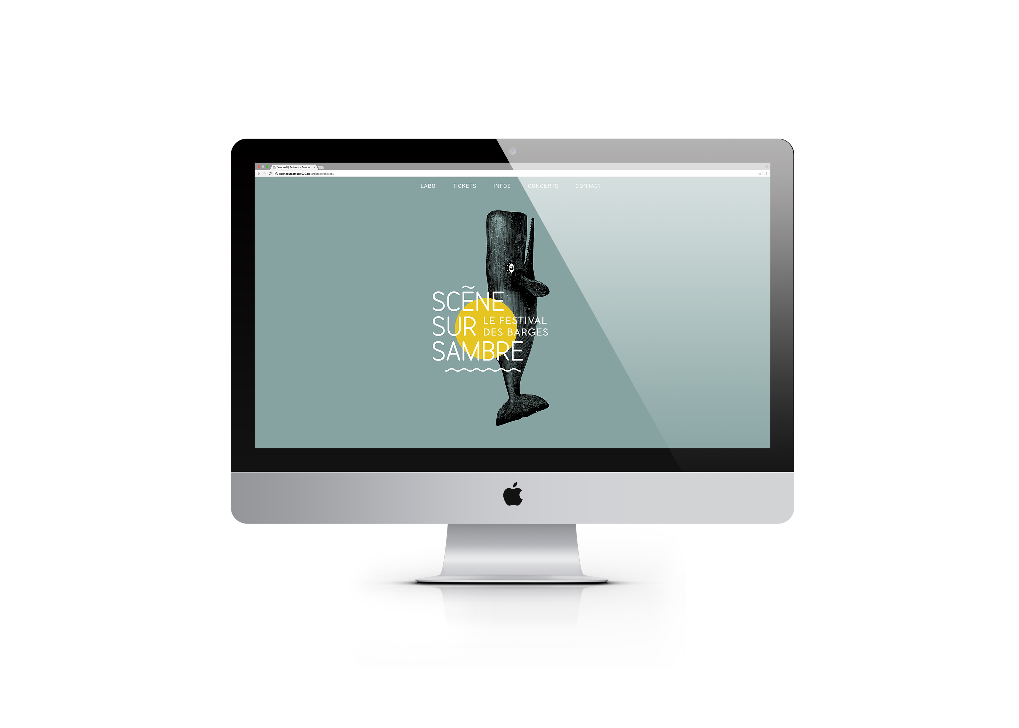
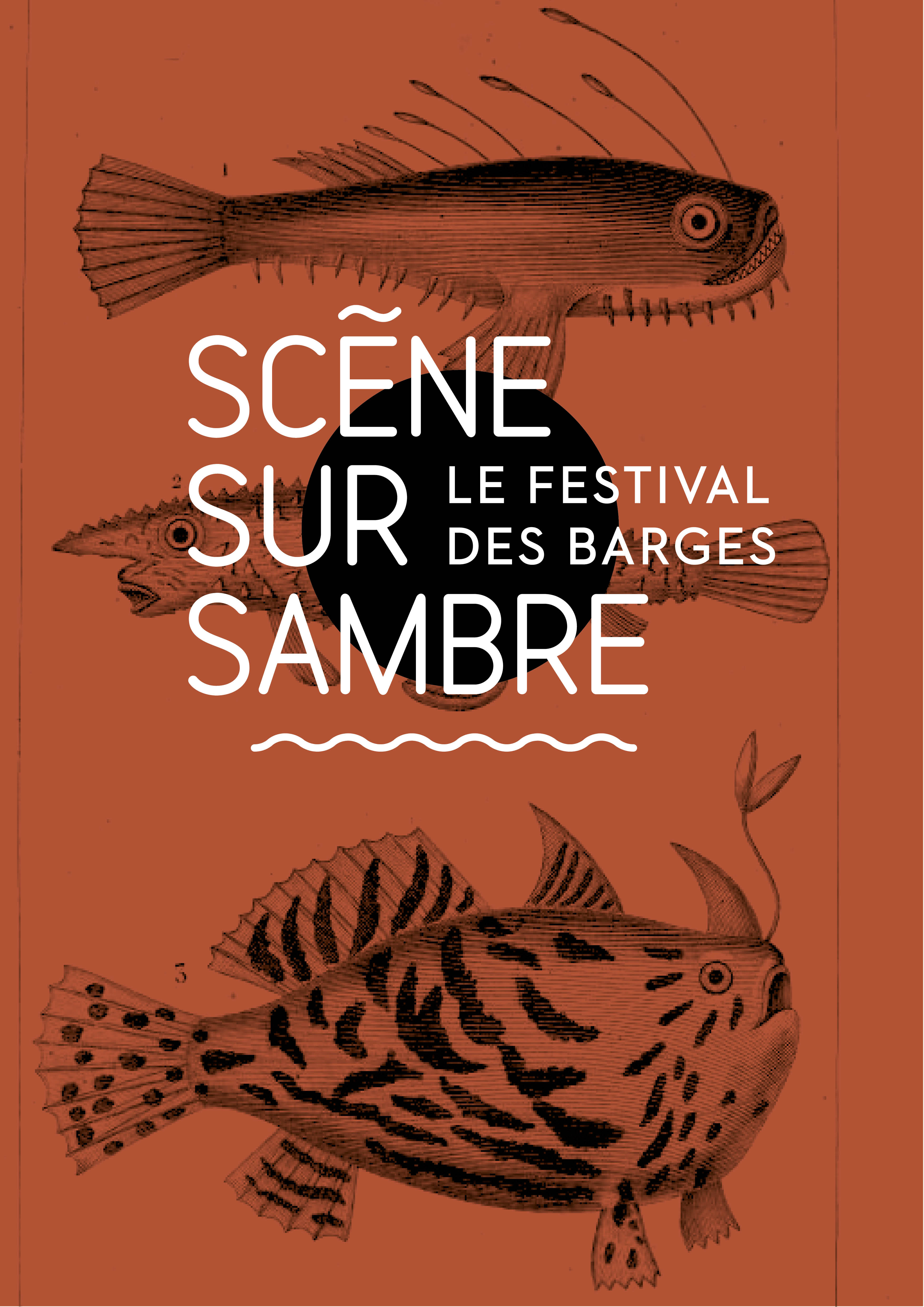
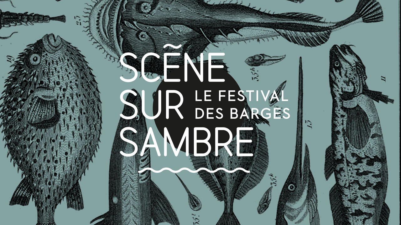
Studio Fiftyfifty fulfilled this challenge by creating a graphic and visual universe referencing the festival’s unusual aquatic features (the main stage floats on the river Sambre).
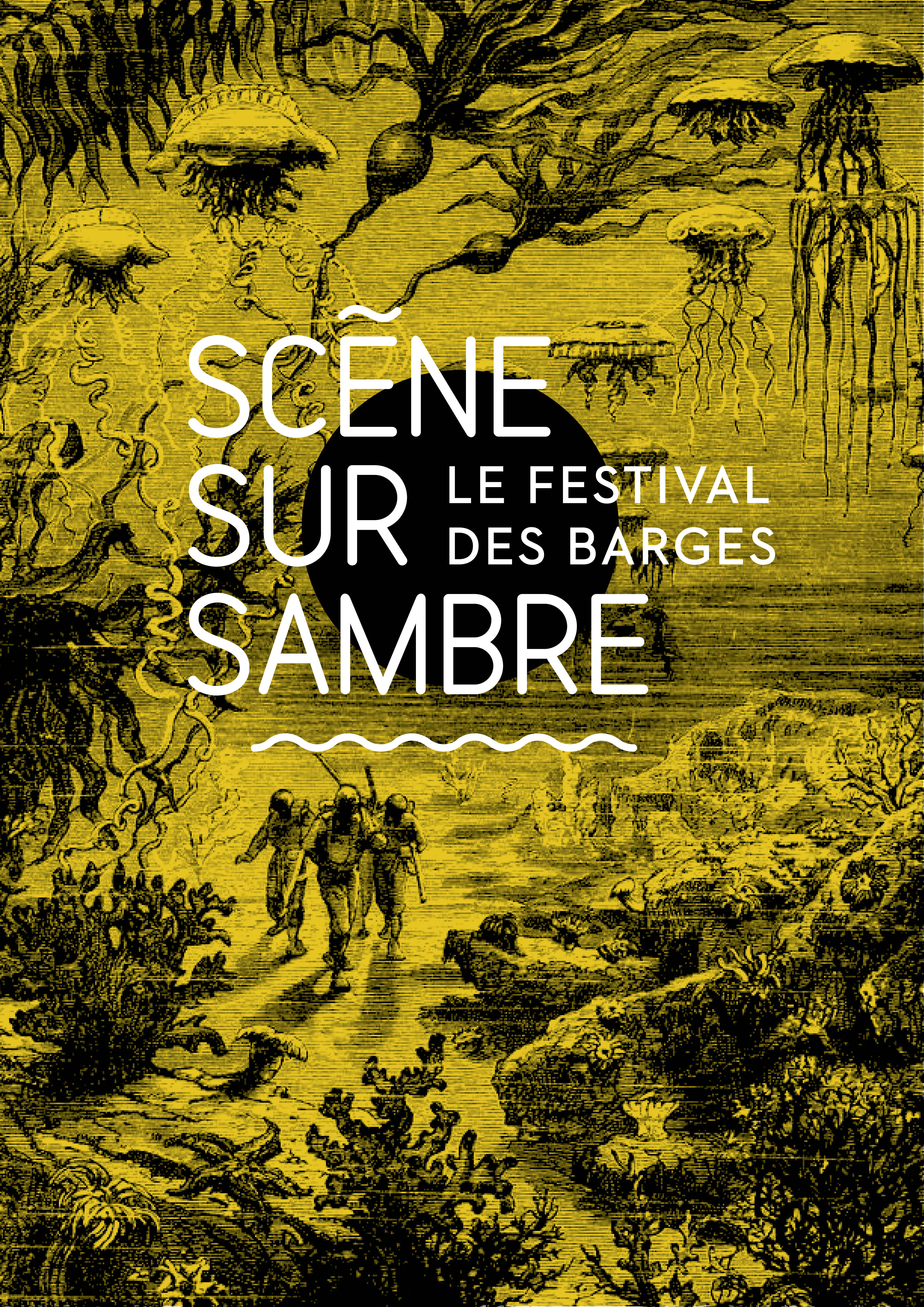
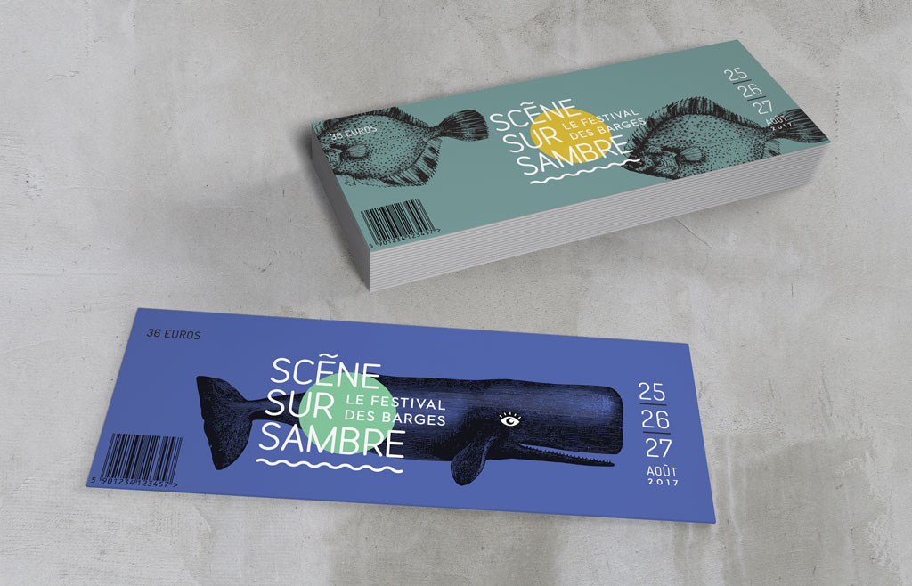
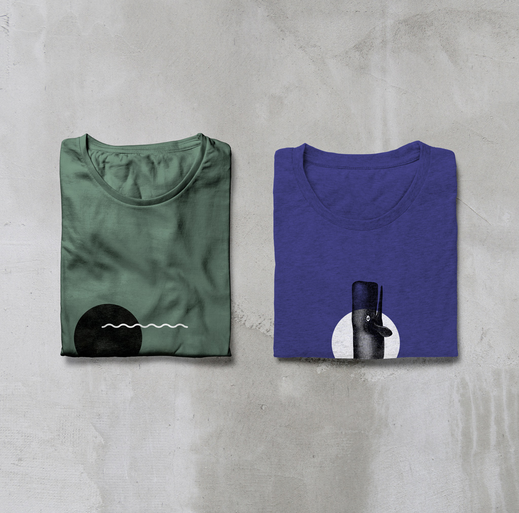
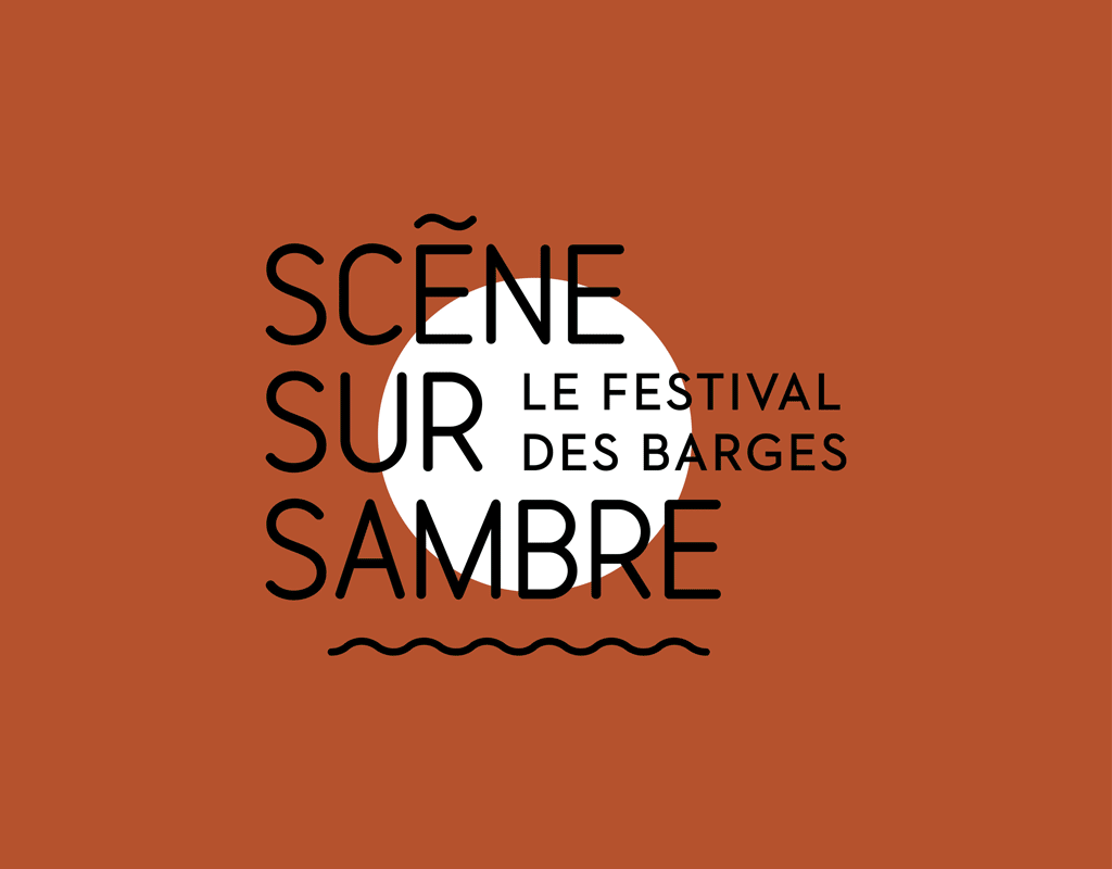
The light, pared-down typography of the logo is accompanied by a sun, literally floating on a stylized ocean. The world of old engravings, drawn from novels related to the marine world (Moby Dick, 20,000 Leagues Under the Sea), as well as strange fish drawn from natural history plates completed the colourful graphic identity.
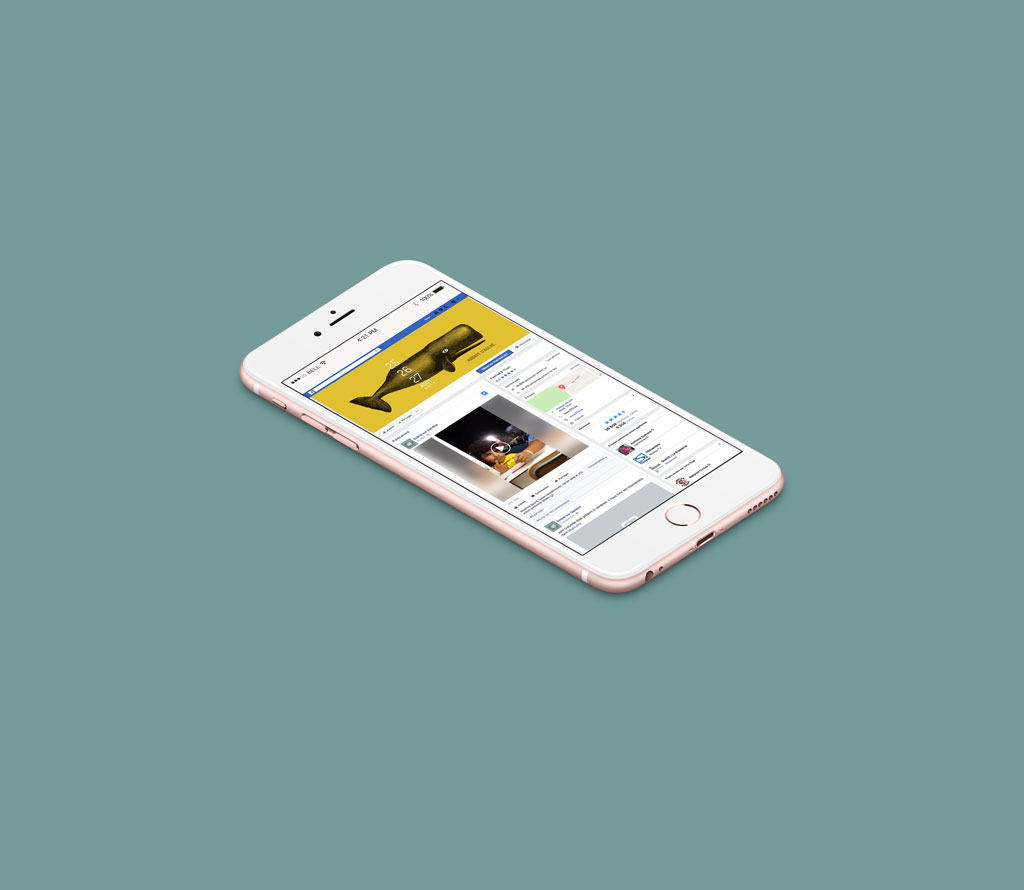
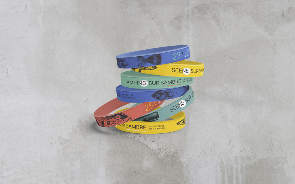
Our Brussels-based graphic design agency established a graphic charter and templates for communications materials to allow the organisers to brand a whole range of materials to ensure strong visual coherence (wristbands, posters, t-shirts, signage, social media posts, etc.).